Redesigning the Onboarding Experience for Trustloop
Redesign of an e-commerce website to improve navigation, increase conversion rates, and enhance the overall shopping experience. The project aimed to create a more visually appealing and user-friendly platform to drive sales and customer satisfaction.
3 weeks
Figma, Notion, Otter.ai
Background
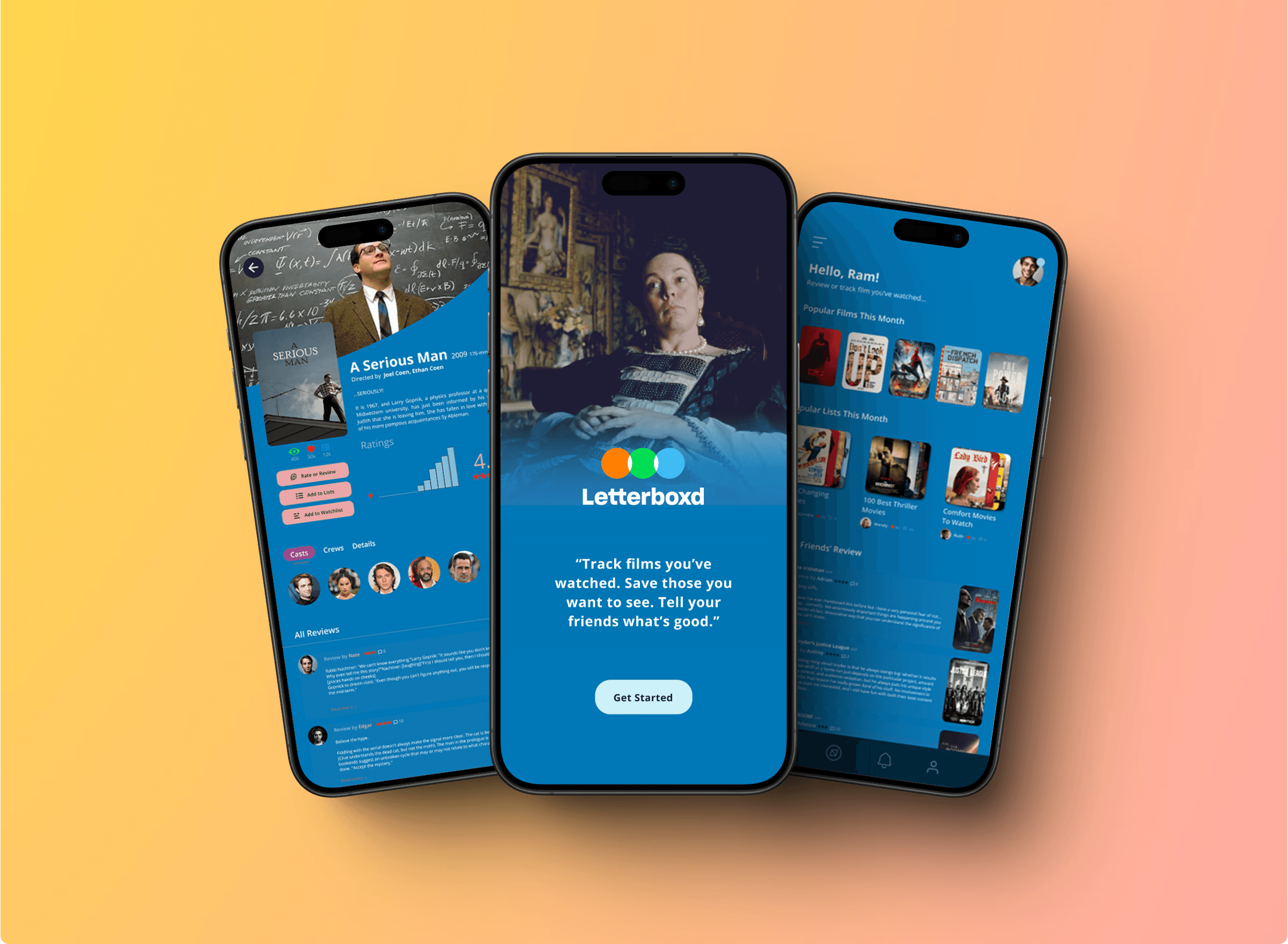
As a movie buff, I often turn to Letterboxd — a social platform for film lovers to log, review, and share their movie-watching experiences. It’s beloved by cinephiles, offering a vibrant community and a massive movie catalog.
But as much as I enjoy the concept, I found myself struggling to use it as a true discovery tool.
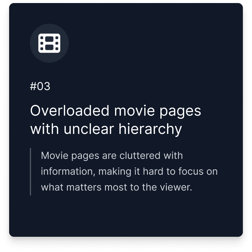
• Reviews lacked context or relevance
• The search felt clunky and unhelpful
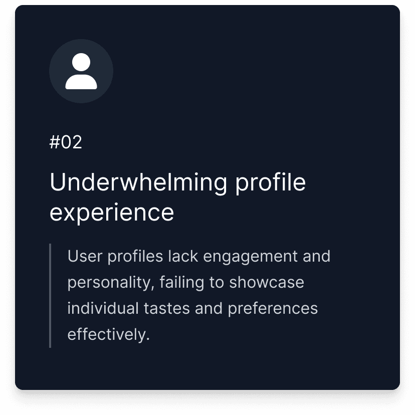
• The profile page was underwhelming and disconnected
• Ads and clutter distracted from the core experience
What if Letterboxd felt more like a trusted film companion — not just a diary, but a smart guide?
So I set out to reimagine how Letterboxd could help users discover and evaluate movies with confidence, clarity, and a personal touch.
Projected Results
30%
Improved movie evaluation clarity
25%
Increase in trust toward recommendations
45%
Increase in discovery feature engagement
As this was a solo project, I planned to measure these projected outcomes using a combination of usability testing and behavioral analytics. To evaluate clarity in movie assessments, I intended to track time-on-task and gather post-task confidence scores during moderated testing sessions. For improvements in profile interaction, I aimed to use simulated clickstream analysis and heatmaps to observe navigation efficiency. To measure trust in recommendations, I planned to run user surveys and analyze engagement signals like review likes or comments. Lastly, I intended to use A/B testing simulations and interaction tracking to assess the impact of newly introduced discovery features such as mood filters and curated lists.
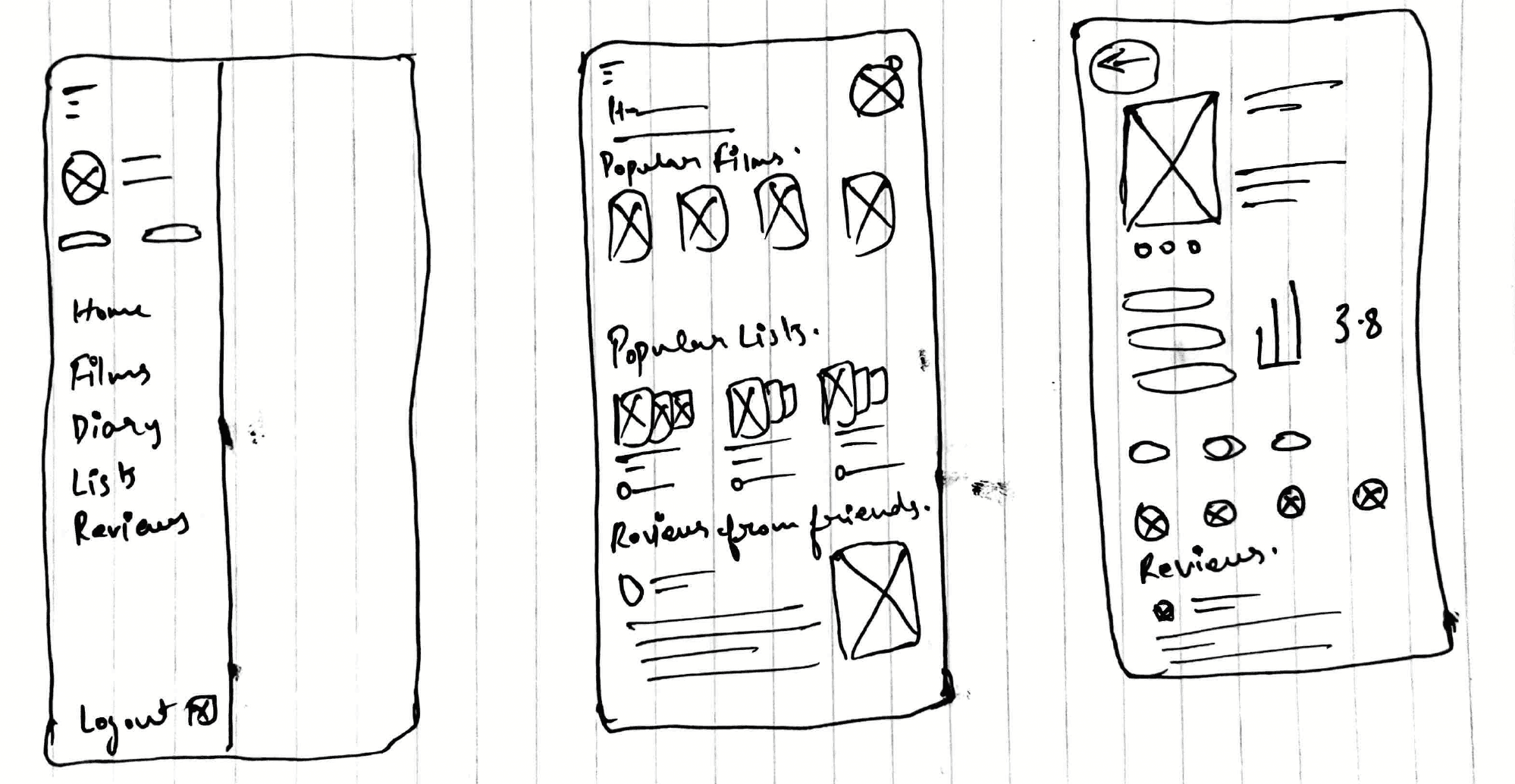
Process
While Letterboxd excels as a social movie logging platform, I noticed gaps in its ability to help users find, trust, and act on recommendations quickly.
As an active user, I experienced frustration with:
• Cluttered interfaces that buried important information
• Reviews lacking relevance or context
• A profile page that felt more decorative than functional
To ground my assumptions, I conducted qualitative interviews with 3 active users. Their feedback echoed many of my own frustrations and helped me identify three core problems:
This phase helped clarify that the issue wasn’t just visual clutter — it was a deeper lack of clarity, context, and personalized navigation across the app.

This phase helped clarify that the issue wasn’t just visual clutter — it was a deeper lack of clarity, context, and personalized navigation across the app.

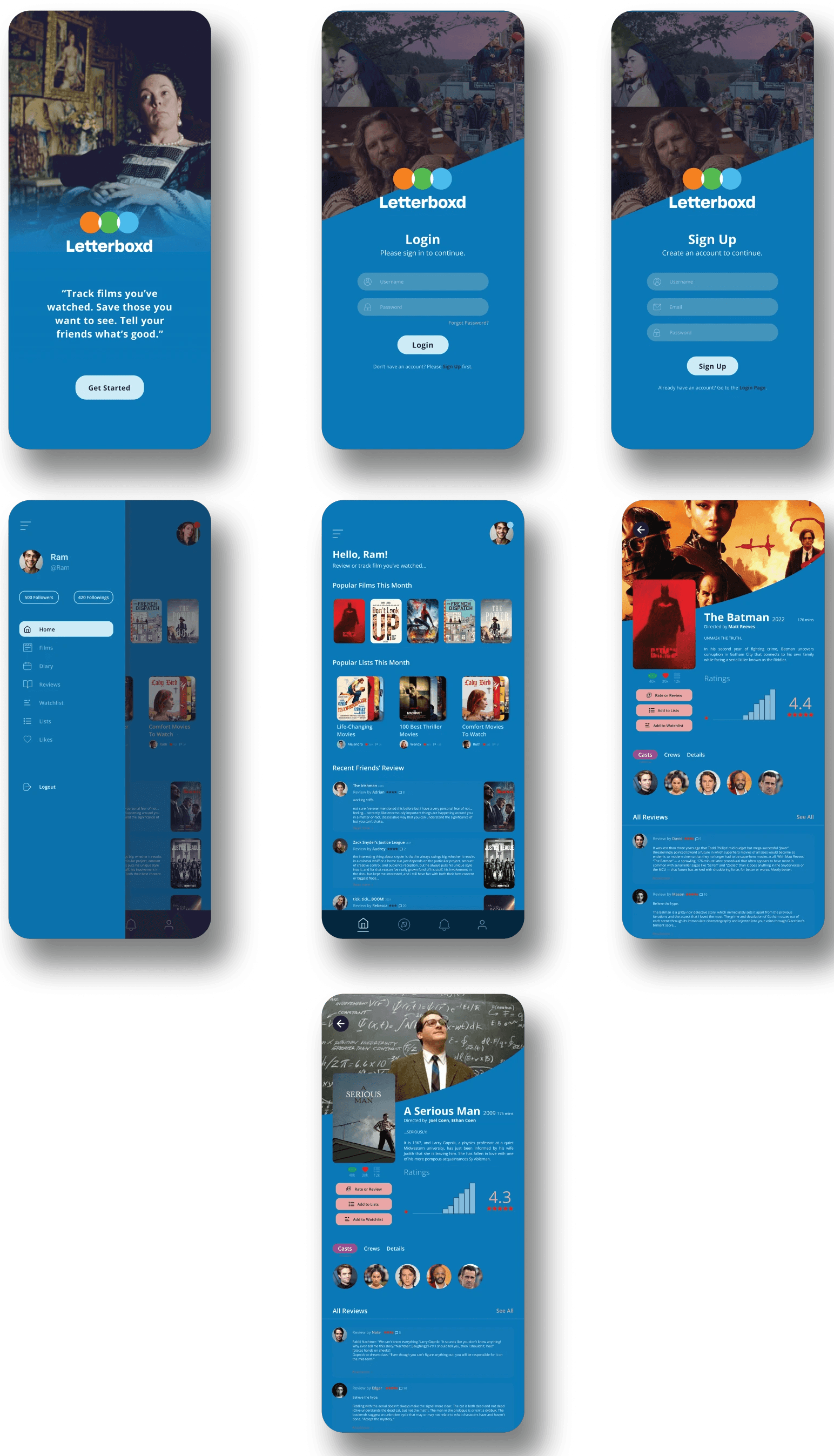
After identifying the root issues, I focused on redesigning Letterboxd with three key goals in mind:
✨ 1. Clarity Over Clutter
Simplify the interface by prioritising essential information — like ratings, reviews, and social cues — to support quick decision-making.
👥 2. Contextual Discovery
Empower users to discover films through people they trust, with filters based on following status, spoiler preferences, and reviewer quality.
🪪 3. Personalised Profiles
Make profiles more expressive and purposeful by surfacing favorite genres, viewing habits, and recent activity in a visually engaging layout.
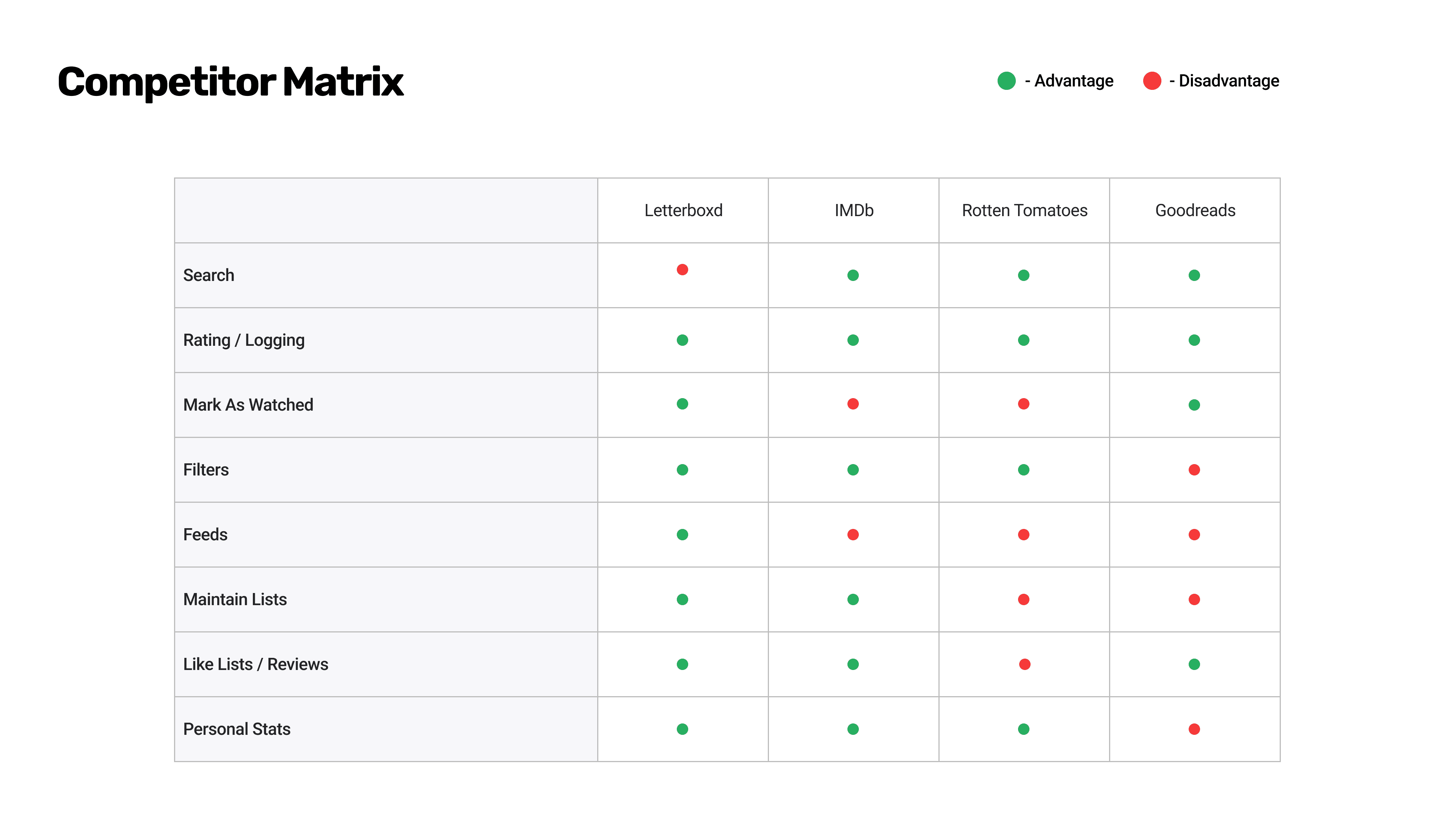
While the redesign solves core usability issues, further validation is key. I plan to conduct usability tests to observe real user behavior, run a heuristic evaluation to catch interface gaps, and distribute a short survey to gather broader sentiment. Keeping an eye on competitors like IMDb and Rotten Tomatoes will also guide future iterations and help sharpen Letterboxd’s positioning.
🧪 Conduct in-depth user testing to observe real-world usage and friction points
🧭 Perform a heuristic evaluation for structural and interface-level improvements
📊 Launch quantitative surveys to validate key UX assumptions at scale
🔍 Monitor and adapt based on competitor trends to refine positioning
Reflection & Learnings
Redesigning Letterboxd as a solo project allowed me to go beyond UI and dive into holistic product thinking. Starting from personal friction points and expanding through user interviews taught me how powerful empathy becomes when it’s validated by user behavior. I focused not only on solving usability issues, but also on defining how success would be measured and how these changes could scale with the product.
To ensure the redesign was grounded in impact, I mapped out projected metrics for validation and iteration. These helped shape the direction of my design decisions and would guide any future collaboration with product managers, engineers, or stakeholders.
Projected Results
30%
Improved movie evaluation clarity
45%
Increase in discovery feature engagement
This case study sharpened my ability to think across the product lifecycle — from identifying problems, designing and testing solutions, to planning realistic metrics and handoff strategies. I now approach UX not just as design, but as measurable problem-solving, and I look forward to carrying that mindset into future product work.
