Redesigning onboarding to preserve user momentum and solve the cold-start problem.
UX Research
UX DESIGN
Owting makes in-person hangouts happen. Its onboarding was doing the opposite. The flow asked for everything upfront and gave nothing back, so users left before seeing what the app could do. I redesigned it around one idea: earn trust before you ask for it.
70%
Reduction in drop-offs
From install to account completion.
80%
Fewer taps required via One-Tap OAuth integration.
Team
Product Manager, Engineer, Designer
My Role
Product Designer
Timeline
4 weeks
50 - 70% of users dropped off between install and account completion. Not because the app failed them. Because the onboarding never gave them a reason to continue.
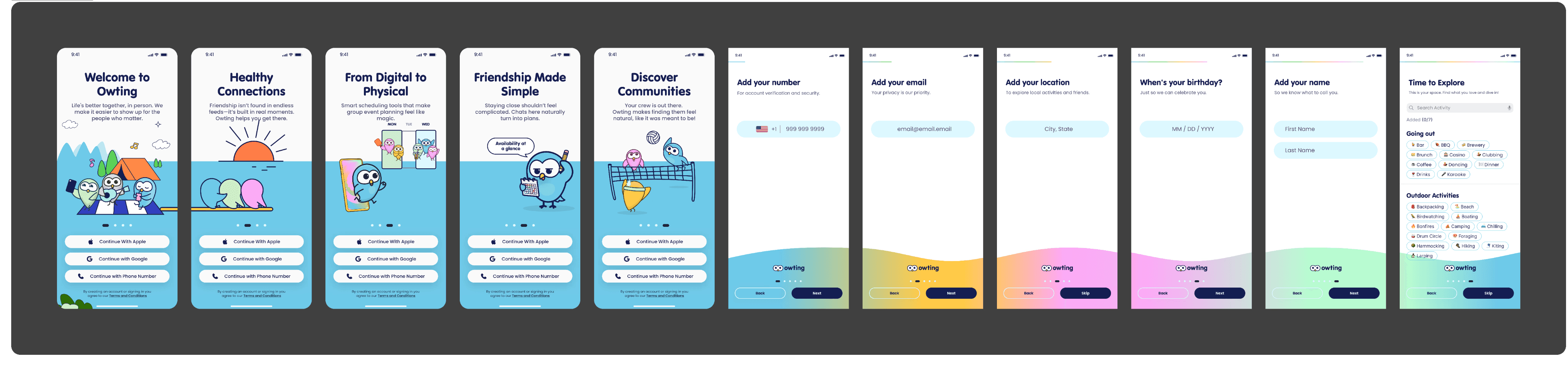
The old flow had no arc. Just asks. A phone number with no context, a login screen that buried the easy option, a form that wanted everything at once, and a landing page with nothing on it. Users weren't confused. They were just never given a reason to continue.

Old Flow
The old flow optimized for data collection. Users optimized for the exit.
Users face significant hurdles during onboarding due to high-friction data requests, a disconnected brand experience, and an immediate lack of engaging content.
Before
Sign-up was step one. Understanding what you were signing up for wasn't part of the flow.
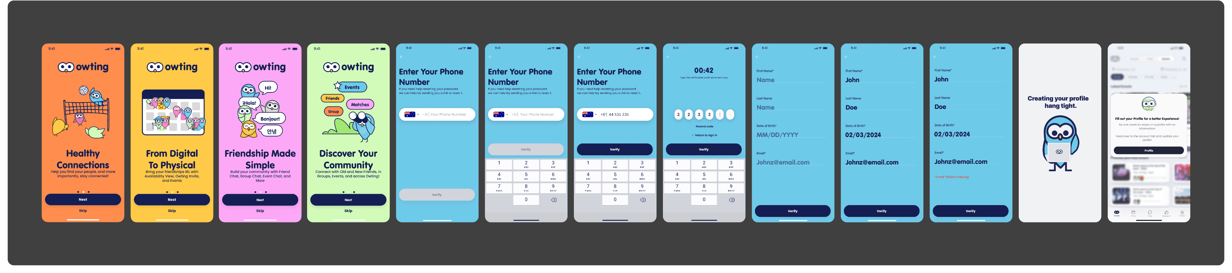
After
A 3-screen value carousel showed what Owting was before asking for anything. Users arrived informed, not interrogated.
Logic
People commit to things they understand. Show the product first, earn the sign-up second.


Manual sign-up (Phone/Email) forced high interaction cost and a slow, multi-step verification loop.

A 2-second authentication preserves momentum and prevents loss of interest during onboarding.


After a long sign-up journey, users landed on an empty events feed. The app that promised real connections offered nothing to connect with. So the landing state was redirected entirely to the Chat screen, where a personal welcome message from the founder greets every new user. The first thing you see is not a feed waiting to be filled, it is someone already talking to you.
Onboarding
/explorations

Drop-off is rarely about effort. It is about trust. Users were not leaving because the flow was too long, they were leaving because nothing in it gave them a reason to stay.
Clarity converts better than brevity
Users did not abandon because there were too many screens. A focused three-screen narrative ending on a single sharp promise drove a 70% reduction in drop-off.
Perceived effort matters more than actual effort
Progress indicators and optional interest selection did not reduce the step count. They reduced how heavy it felt, cutting interaction cost by 80%.
The first post-onboarding moment is part of the onboarding
Redirecting from an empty feed to a live chat screen made the product's promise tangible within seconds of signup.